Best Grid System for Interface Design
Dec 01, 2021 — UI/UX Assets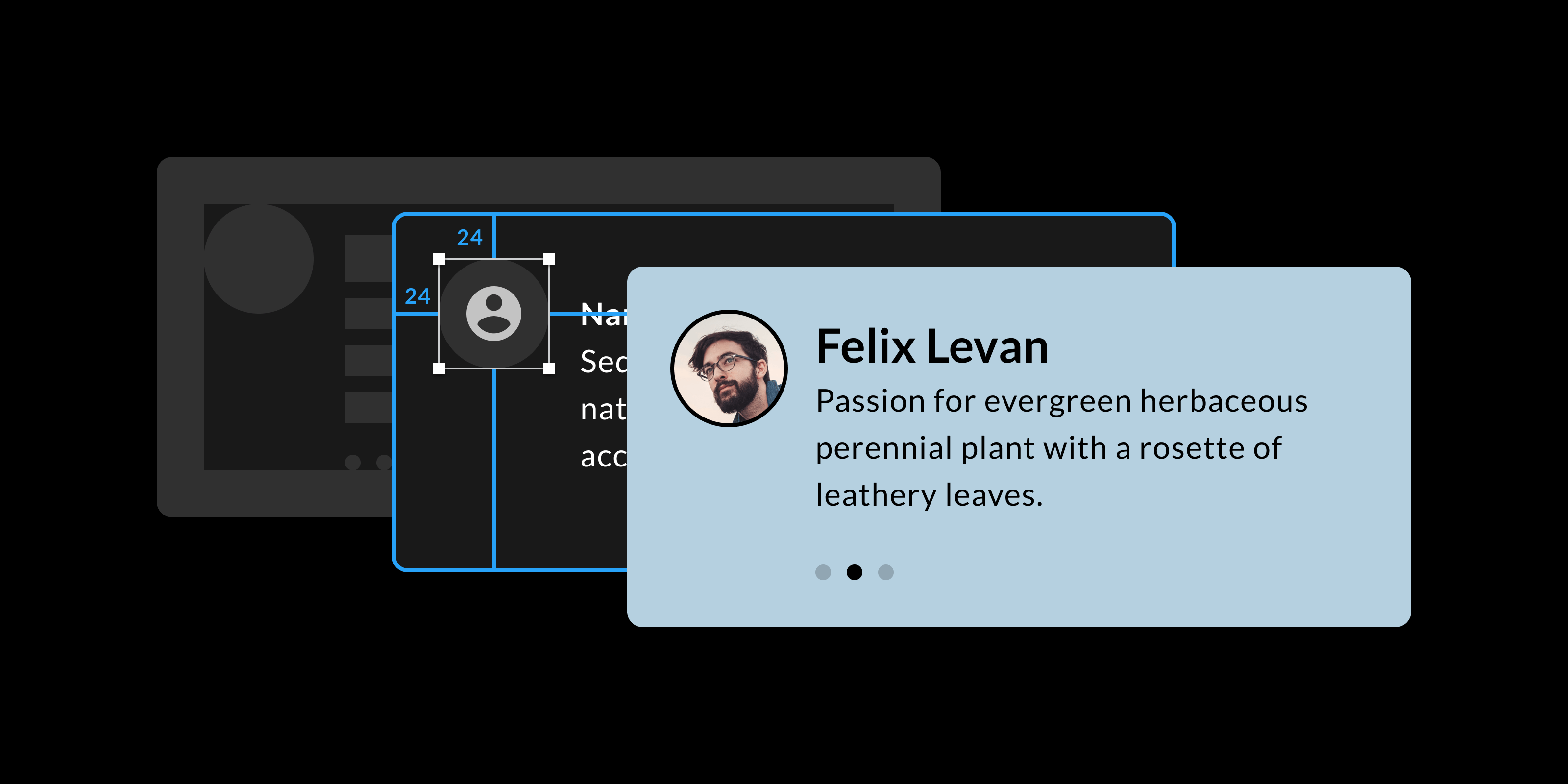
An easy step to improve the overall harmony of an interface is to be consistent when it comes to spacing between elements. It all boils down to having a grid that your design follows. It's not much about the size of each component but more about the spacing in between. It's like the dark matter of your interface that holds everything together. If this empty space follows a well-defined logic, your interface will feel more structured.
As an example, take a module containing a chart, a title, and some values. It's not very important if the module measures 480px in width; the tiny bits matter. If the spacing between elements is based on specific numbers and not some random ones, everything will have a touch of consistency and order.
Additionally, a grid will also help make more informed choices and move forward quickly when laying out your design. Instead of thinking about the distance between two elements, knowing that 8px or 16px are commonly used, you can quickly define the spacing and move forward.
Which grid should you choose?
There are many popular grids, and to be honest, it doesn't matter which one you choose. What matters is consistency, that you pick a grid and you stick to it.
Personally, I use the 8px grid. It's a popular one, and I've used it for years. My brain jumps between those numbers: 16, 8, 48, 64, 80, and so on. I would recommend a grid with an increment that isn't too large or too small. You want to see the difference between two increments (8px and 16px, or 24px and 32px). Another popular one is 10px but dividing 10 by 2 equals 5, or adding half of your main nudge equals 15, dividing that by 2, and you end up with 7.5px. Well, you get the idea; I find it less flexible.
As you might have noticed, I used the word "nudge". You can change this value in the settings of Sketch and Figma. Then you can use your arrow keys to nudge your elements around. The "small nudge" with just the arrow keys. And the "big nudge" when you hold down the shift key.
Exceptions are fine
What if you're using the 8px grid and neither 8px nor 16px looks good or is practical. Break the rule and use a 4px spacing, 6px, or whatever works for that specific element. What if 7px is the perfect balance between your icon and text? That is fine!
Keeping your team and developers happy
Another important note is that your team should be in line with the grid. Especially developers, knowing that your design is based on a grid helps them too.