From Wireframe to Concept Design in Sketch
Hi, and welcome to the Wireframe to Concept Design course in Sketch. In this course we’ll learn how to go from a really simple sketch to a high fidelity wireframe, to finally create a more polished UI concept. In the first section we’re setting up a document with some typography and colors. As well as putting our artboards in place.
Some key focus of the course are symbols, as well as responsive elements, just to make us flexible and open to feedback and changes. Pretty much to make the process as seamless as possible.
The app that we’re creating is listing events and locations that users can like or check-in to. And as you will notice, many of the ideas will change during the process.
Ok, let’s get started.
Preparing the Document
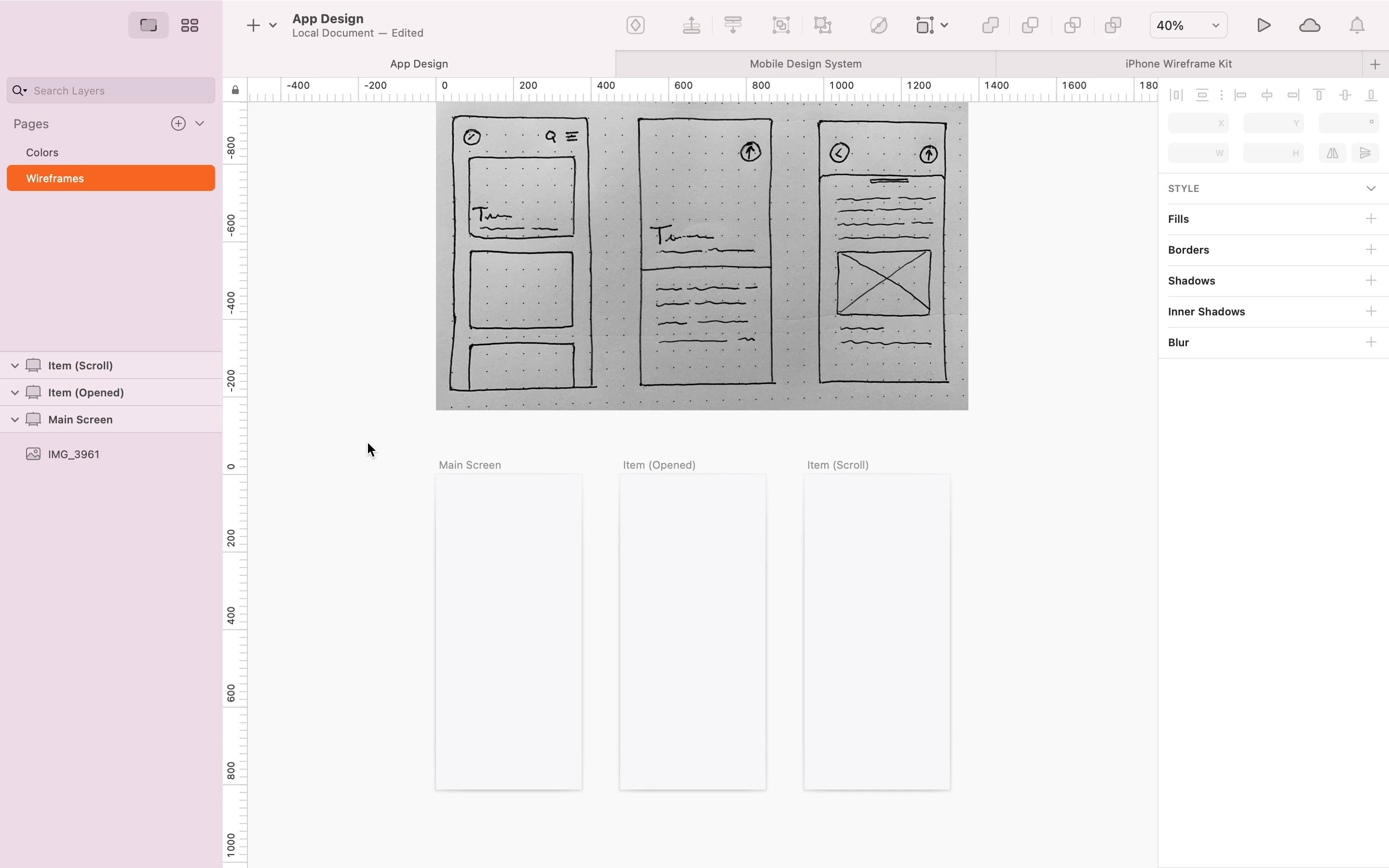
The first step of this course is to get a document up and ready. We'll import some color variables and typography to get things rolling. Then, according to our initial sketches we'll create some artboards.
From Low to High Fidelity Wireframe
Learn how to create layers and symbols to get the wireframe to a higher level of detail.

Wireframe Refinement
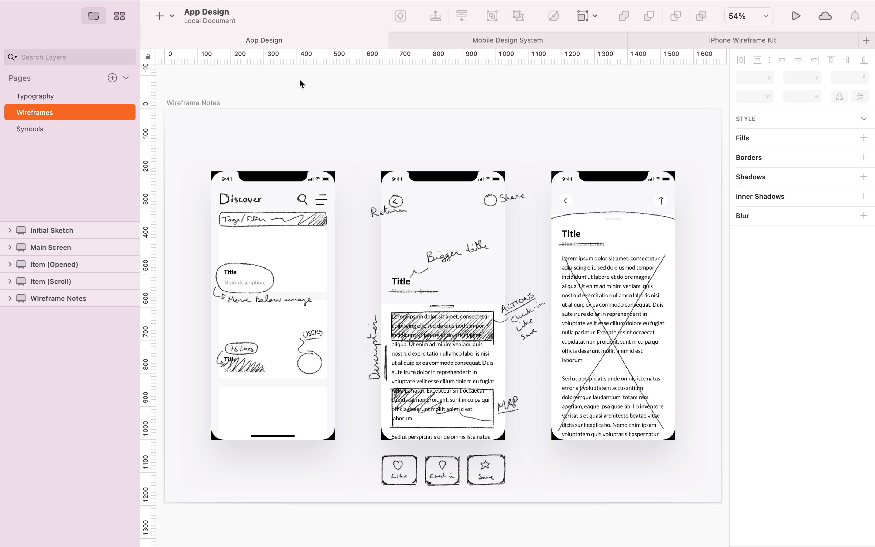
Before starting the process of developing the concept, an iteration on the current wireframe is taken place.
Concept Development
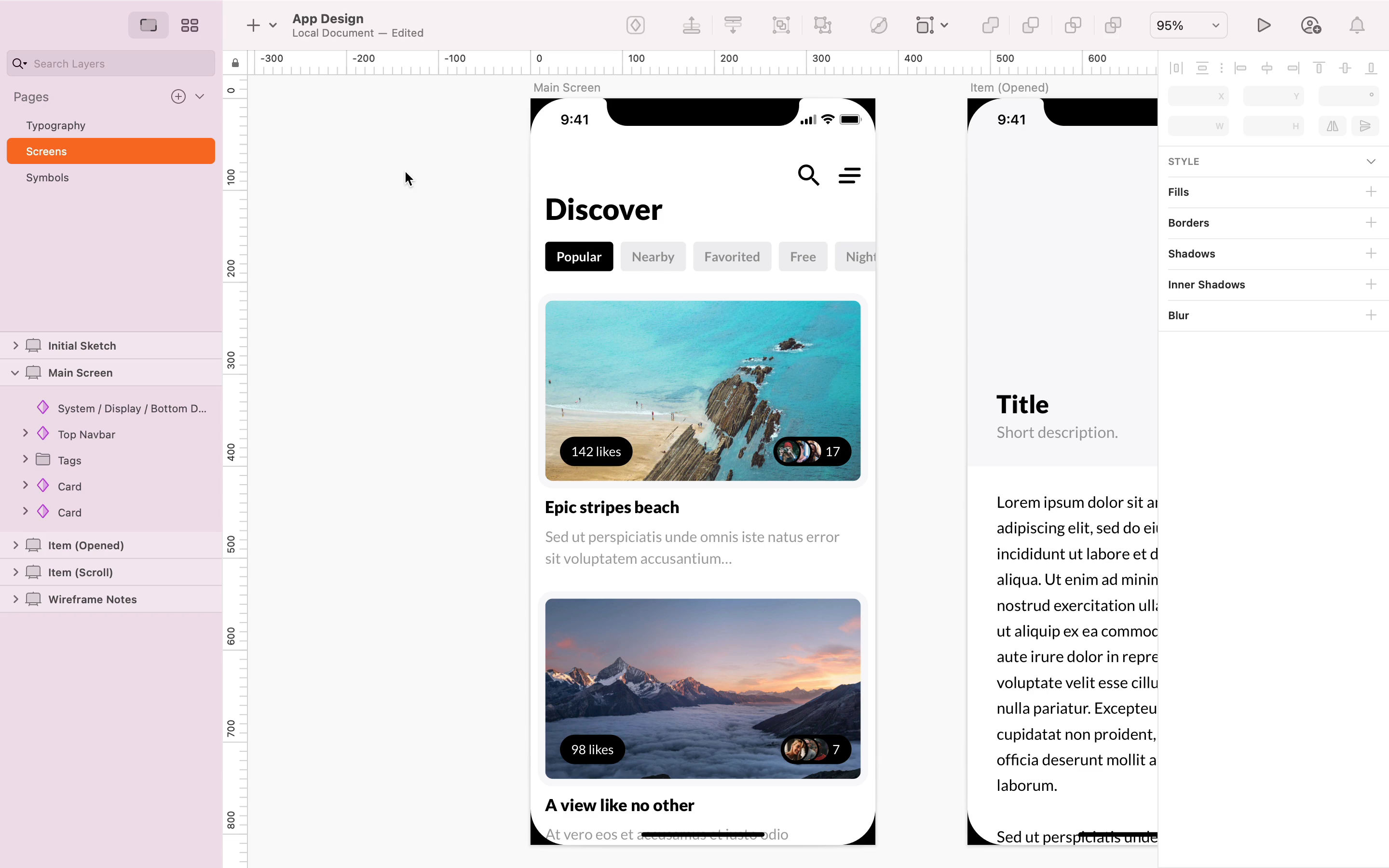
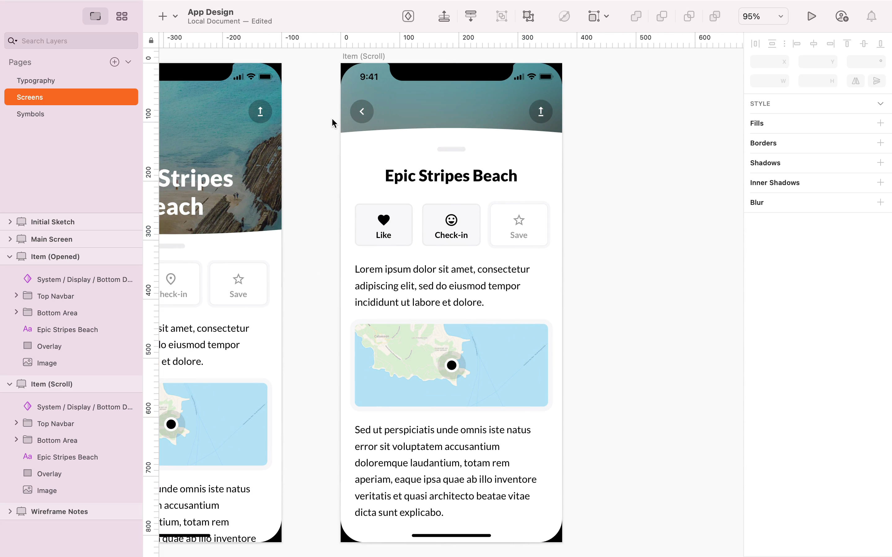
Following the wireframes, the concept development is started. Here are some of the key points:
- Following a consistent grid.
- Creating layers.
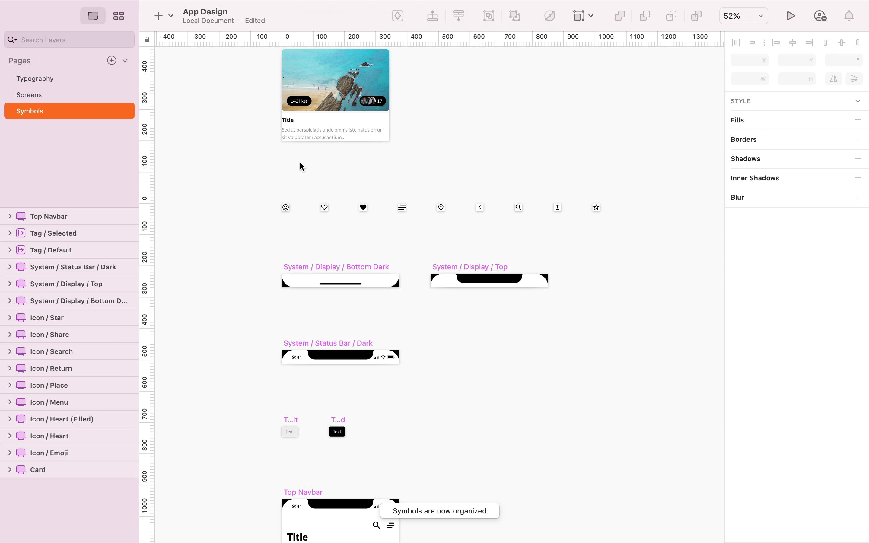
- Creating and organizing symbols.
- Working with constraints to make screens responsive.

Creating and Organizing Symbols
A key focus of this course is to learn good practices on how to stay organized. Mainly this consists of creating symbols, variables and good naming conventions.
Testing the App
During the course we continually test the app on a mobile to get all the proportions and UX just right.
